Teck Resources 24'
Teck Resources 24'
Teck Resources 24'
PortOps Redesign
PortOps Redesign
PortOps Redesign


My Role
My Role
UX/UI Designer
UX/UI Designer
Interaction Design, Visual Design, User Flows, Information Architecture, User Research
Interaction Design, Visual Design, User Flows, Information Architecture, User Research
Team
Team
Vivien A. - UX Lead
Thomas Y. - SWE
Bich H. - SWE
Cam M. - Supervisor
Wilson - PM
Timeline & Status
Timeline & Status
1 year, Launched June 2024 with a 155.2% increase in usability
1 year, Launched June 2024 with a 155.2% increase in usability
Overview
Overview
PortOps is a B2B web-based tool that allows efficient vessel scheduling, coal loading, and train dumping operations to be performed at the port terminal.
I owned and led the design strategy for the PortOps redesign to support Teck Resource’s push into digitizing the mining experience – playing a critical role in scoping and providing design solutions, while modernizing the tool to align with business goals. A large focus was also on the usability as the old tool had a poor SUS score of 36.25.
The launch of the tool in 2024 marked the first project to have been delivered by the Teck Digital Analytics team, and it was met with high praise from key stakeholders - with a new SUS score of 92.5 (increased by 155%).
HIGHLIGHTS
HIGHLIGHTS
Transforming the future of mining
Transforming the future of mining
“Old-fashioned” practices to a modern, yet familiar digital experience.
“Old-fashioned” practices to a modern, yet familiar digital experience.
01 - After vs. Before
01 - After vs. Before
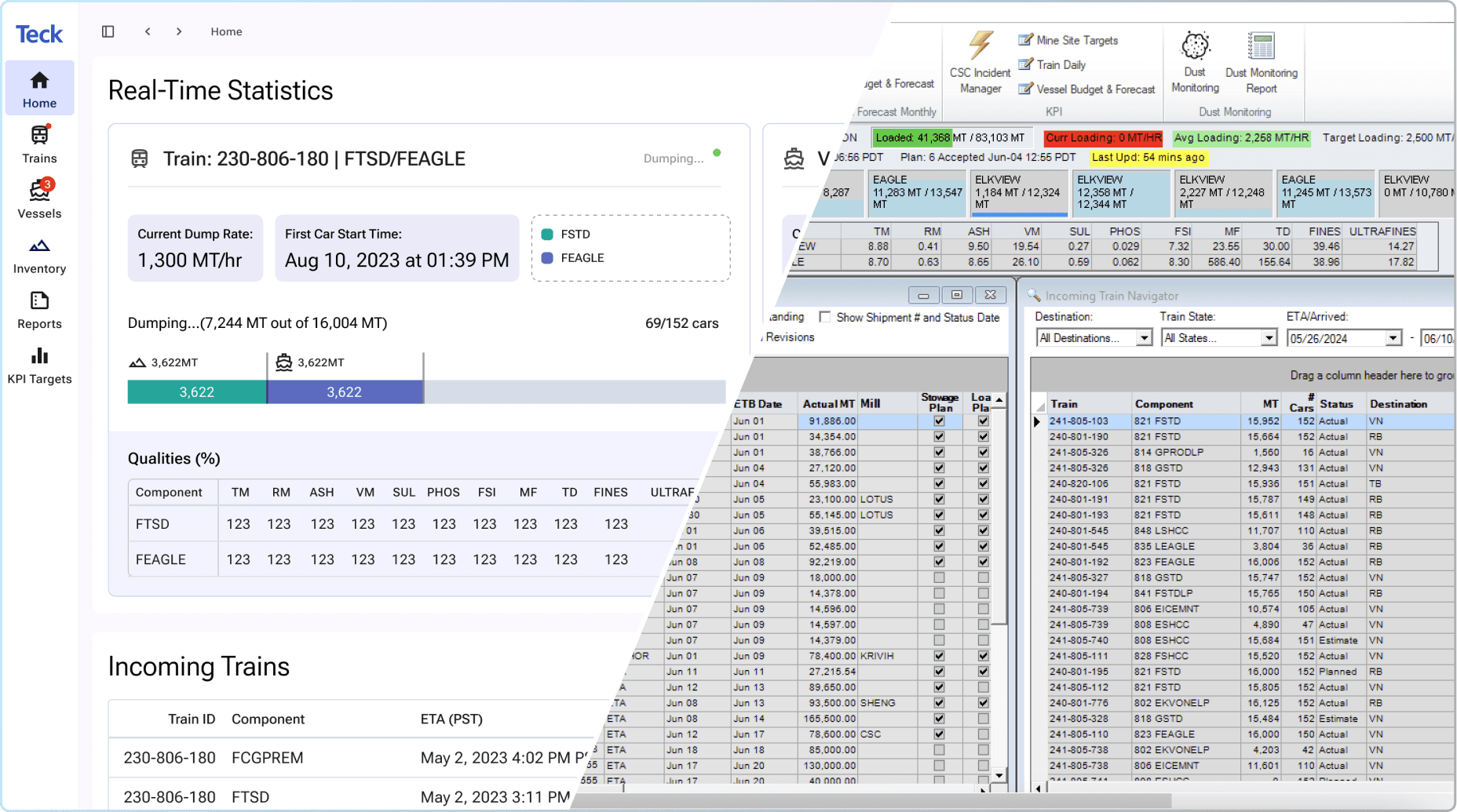
View coal transportation details at a glance
View coal transportation details at a glance
The biggest difference between the old and new design is the complete interface refresh. This overall design transforms the clunky, outdated desktop tool into an intuitive coal transportation organizer that allows collaborative planning. Users who don’t have the tool downloaded can now access this easily via browser and quickly view shipment details or make necessary changes without multiple points of contact.
The biggest difference between the old and new design is the complete interface refresh. This overall design transforms the clunky, outdated desktop tool into an intuitive coal transportation organizer that allows collaborative planning. Users who don’t have the tool downloaded can now access this easily via browser and quickly view shipment details or make necessary changes without multiple points of contact.
02 - Main navigation.
02 - Main navigation.
Straightforward navigation transformed from a laundry list of features
Straightforward navigation transformed from a laundry list of features
The new design has a clear navigation system where users will no longer have a hard time finding pieces of information to complete their tasks. Despite having a great set of features and tools, the old design has become heavily overwhelming with the growing laundry list of features.
A big emphasis on the project was to dissect and rearrange everything to fit in spaces that make the most sense to our users and professionals in the field. We did this by…
1. Reframing PortOps as not just a tool with lots of features for miscellaneous tasks, but an organized planner with a focused set of resources.
2. Grouping the quantity of selections our users have to make when they arrive at the home dashboard.
3. Assigning a designated place for information to live while also allowing the space for our tool to scale.


03 - Old stockpile vs. New Yard Management with defined stockpiles
03 - Old stockpile vs. New Yard Management with defined stockpiles
Reflecting real processes to digital tasks
Reflecting real processes to digital tasks
We developed visual solutions in the tool that accurately mirror real-life, so our users can digitally create plans that make sense between all parties involved. Every element was given definition and meaning behind it for clarity and ease of understanding. Repetitive, outlined rectangles on a white space, became individual stockpiles that showed how the yard will be laid out at the terminals. This allows our users to easily share updated yard plans and collaborate with the terminal team.
We developed visual solutions in the tool that accurately mirror real-life, so our users can digitally create plans that make sense between all parties involved. Every element was given definition and meaning behind it for clarity and ease of understanding. Repetitive, outlined rectangles on a white space, became individual stockpiles that showed how the yard will be laid out at the terminals. This allows our users to easily share updated yard plans and collaborate with the terminal team.
CONTEXT
CONTEXT
A collective objective to transport coal efficiently.
A collective objective to transport coal efficiently.
With the digital space defining modern mining practices, it was time to revisit old tools holding us back.
With the digital space defining modern mining practices, it was time to revisit old tools holding us back.

04 - A simplified map to show the process of coal transportation
04 - A simplified map to show the process of coal transportation
Where do our users work?
Where do our users work?
Our users, Teck's Coal Logistics team, work out of an office by Waterfront, Vancouver. I visited their office and obtained permission to visit the terminals where operations to distribute coal are performed.
Our users, Teck's Coal Logistics team, work out of an office by Waterfront, Vancouver. I visited their office and obtained permission to visit the terminals where operations to distribute coal are performed.
How do our users work?
How do our users work?
Their day-to-day revolves around planning vessel departures, train arrivals, what type of coal goes into which vessel, and where the coal will go - either into a vessel or into a stockpile for later. They work closely with the port workers at Neptune Terminals, and they are consistently communicating with each other to ensure the most effective workflow. Both teams have the same goal of successfully exporting coal to our customers as quickly and efficiently as possible. PortOps is the tool where all their shared data lives, and it is where our users plan these operations.
Their day-to-day revolves around planning vessel departures, train arrivals, what type of coal goes into which vessel, and where the coal will go - either into a vessel or into a stockpile for later. They work closely with the port workers at Neptune Terminals, and they are consistently communicating with each other to ensure the most effective workflow. Both teams have the same goal of successfully exporting coal to our customers as quickly and efficiently as possible. PortOps is the tool where all their shared data lives, and it is where our users plan these operations.
PROBLEM
PROBLEM
One of Teck’s oldest applications that is “unnecessarily complex”
One of Teck’s oldest applications that is “unnecessarily complex”
Being developed over 20 years ago, this wasn’t your typical interface redesign. There were a pile-up of added features that were no longer in use but occupying space.
Being developed over 20 years ago, this wasn’t your typical interface redesign. There were a pile-up of added features that were no longer in use but occupying space.
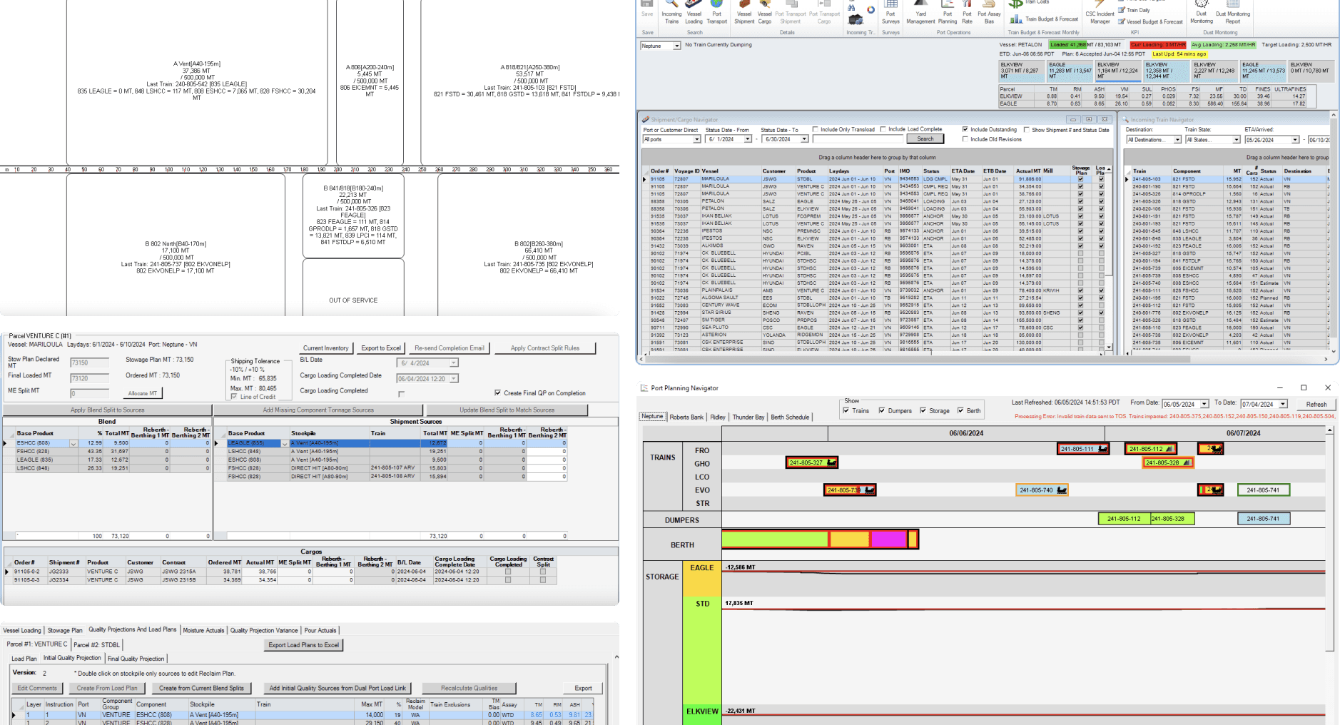
05 - Looking into the old PortOps
Amongst the tool, this is what we found...
Amongst the tool, this is what we found...

Here’s what our users had to say about the old tool:
Here’s what our users had to say about the old tool:

PortOps works as intended (for the most part). However, it is fragile - it will crash or create problems for the user if not used in a specific way. I have no idea what a lot of it does, but I’m able to complete my tasks (I guess).
PortOps works as intended (for the most part). However, it is fragile - it will crash or create problems for the user if not used in a specific way. I have no idea what a lot of it does, but I’m able to complete my tasks (I guess).

After a year, I am fairly confident I can get the information I need and submit plan reports as needed, but I often need to request IT help. The system is also very slow, which makes data entry and editing cumbersome.
After a year, I am fairly confident I can get the information I need and submit plan reports as needed, but I often need to request IT help. The system is also very slow, which makes data entry and editing cumbersome.

The user interface is not user friendly. I find myself taking extra steps to create extra reports for our workers at the terminal because a lot of them find it too difficult to learn where the data is in PortOps.
The user interface is not user friendly. I find myself taking extra steps to create extra reports for our workers at the terminal because a lot of them find it too difficult to learn where the data is in PortOps.

Although some functions are good, the system is very slow and has many bugs.
Although some functions are good, the system is very slow and has many bugs.
Throughout the years, there was a lot added... but nothing was removed.
Throughout the years, there was a lot added... but nothing was removed.
The quotes from above were from initial user interviews for a UX audit of PortOps. The UX audit found system slow and complex. Upon opening the app, it is clear that PortOps was designed with no scalability and no adaptability in mind. To do any task, users spend 35-45 seconds waiting for the page to load. A large number features have been added while nothing has been removed. This lead to many unused features cluttering the interface that no one, not even the users, knew the purpose for.
The quotes from above were from initial user interviews for a UX audit of PortOps. The UX audit found system slow and complex. Upon opening the app, it is clear that PortOps was designed with no scalability and no adaptability in mind. To do any task, users spend 35-45 seconds waiting for the page to load. A large number features have been added while nothing has been removed. This lead to many unused features cluttering the interface that no one, not even the users, knew the purpose for.
So...
So...
How might we support users to efficiently plan vessels and trains?
How might we support users to efficiently plan vessels and trains?
How might we support users to efficiently plan vessels and trains?
and
How might we make the planning process scalable to reflect business changes?
How might we make the planning process scalable to reflect business changes?
How might we make the planning process scalable to reflect business changes?
RESEARCH AND EXPLORATION
RESEARCH AND EXPLORATION
Understanding our users from the start to finish.
Understanding our users from the start to finish.
With an overwhelming amount of information in the tool, our users came up with their own “hacks” or work-arounds to quicken their workflow.
With an overwhelming amount of information in the tool, our users came up with their own “hacks” or work-arounds to quicken their workflow.

06 - What do our users use?
06 - What do our users use?
What features are our users using to complete their tasks and how often?
What features are our users using to complete their tasks and how often?
It was critical to first understand where our users visit most often. Through a series of workshops, we had our users go through each feature in the tool with us and show us where they believe would fit (Figure 6).
Based on more user interview data and interviews with additional subject matter experts, we were able to determine which features could be taken out. But, this still left us with an overwhelming amount of information to work with.

07 - A couple of existing user flows that I mapped out
07 - A couple of existing user flows that I mapped out
How are they completing each task?
How are they completing each task?
I wanted a better idea of their journeys into completing each task. Through a series of interview sessions, I decided to screenshot the path each user would take me. I created a huge research Miro board that documented each existing user flow for the tasks that they frequently used, so this would visually allow me and our development team to better understand what we would really be working with.
With the user journey data, I was able to understand what the architecture of currently used features looked like.

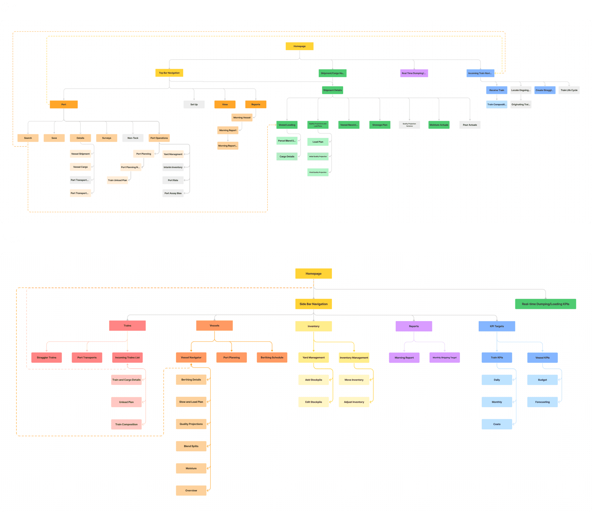
08 - Old vs New information architecture
08 - Old vs New information architecture
Discovering intuitive navigation by creating new flows in an effective structure.
Discovering intuitive navigation by creating new flows in an effective structure.
The old information architecture map showed multiple levels of nesting with only 40% of PortOps frequently used features.
We designed the new information architecture to be more consistent while also keeping the user’s needs and mental model in mind. Main flows are no longer nested in a confusing way, and they are still primarily kept the same. We made choices flexible by assessing potential limitations to accommodate for future growth or change of content, so the new IA can easily expand or evolve.


09 -Various sketch concepts/drafts
09 - Various sketch concepts/drafts
Making abstract concepts tangible through sketching.
Making abstract concepts tangible through sketching.
Due to the fast-paced nature of our project, I sketched wireframes to quickly explore concepts and communicate ideas with my team. Doing it in Procreate allowed me to make fast iterations and refinements during collaboration discussions, and it helped us identify potential issues and areas for improvement before creating wireframes.
Due to the fast-paced nature of our project, I sketched wireframes to quickly explore concepts and communicate ideas with my team. Doing it in Procreate allowed me to make fast iterations and refinements during collaboration discussions, and it helped us identify potential issues and areas for improvement before creating wireframes.
DESIGN ITERATIONS
DESIGN ITERATIONS
DESIGN ITERATIONS
Quick wins for what was already working
Quick wins for what was already working
Quick wins for what was already working
We wanted to keep workflows that already made sense without unnecessarily reinventing the wheel - but with a modern interface refresh.
We wanted to keep workflows that already made sense without unnecessarily reinventing the wheel - but with a modern interface refresh.
We wanted to keep workflows that already made sense without unnecessarily reinventing the wheel - but with a modern interface refresh.
Iterative Process: Creating blend splits for vessel parcels
Iterative Process: Creating blend splits for vessel parcels
Old PortOps
Old PortOps

Lo-fidelity design
Lo-fidelity design

TESTING FEEDBACK #1:
Vessel details in as tags were not clear - users would prefer for it to be in the title
Users did not like too much negative space
Users would prefer for information to be more condensed, so they won’t have to scroll to view more
Hi-fidelity design
Hi-fidelity design

TESTING FEEDBACK #2:
There are too many actions - many which they no longer use
Too many tables look the same and they would prefer more of a “dashboard” view
Revisit how “Blend” is being shown - they would prefer for tables not to be side-by-side
WHAT USERS LIKED:
Better, condensed spacing
Clear status of vessel
Being able to see main details of vessel in the title
Final design
Final design
FIXED ISSUES BY INCORPORATING:
Quick view of “Blend mix”
Removing unnecessary CTA buttons
Showcasing displayed information as a dashboard, but also allowing quick edits
Layout with clear surfaces to separate important info
THE FINAL DESIGN INCORPORATED:
Quick view of “Blend mix”
Removing unnecessary CTA buttons
Showcasing displayed information as a dashboard, but also allowing quick edits
Layout with clear surfaces to separate important info
THE FINAL DESIGN INCORPORATED:
Quick view of “Blend mix”
Removing unnecessary CTA buttons
Showcasing displayed information as a dashboard, but also allowing quick edits
Layout with clear surfaces to separate important info
10 - Design process for Blend Splits
10 - Design process for Blend Splits
Redefining the modern mining process.
Redefining the modern mining process.
For other pages, we needed to start by properly defining workflows to avoid ambiguity within teams.
For other pages, we needed to start by properly defining workflows to avoid ambiguity within teams.
Iterative Process: Building a transparent view for stockpile yard management
Iterative Process: Building a transparent view for stockpile yard management
Old PortOps

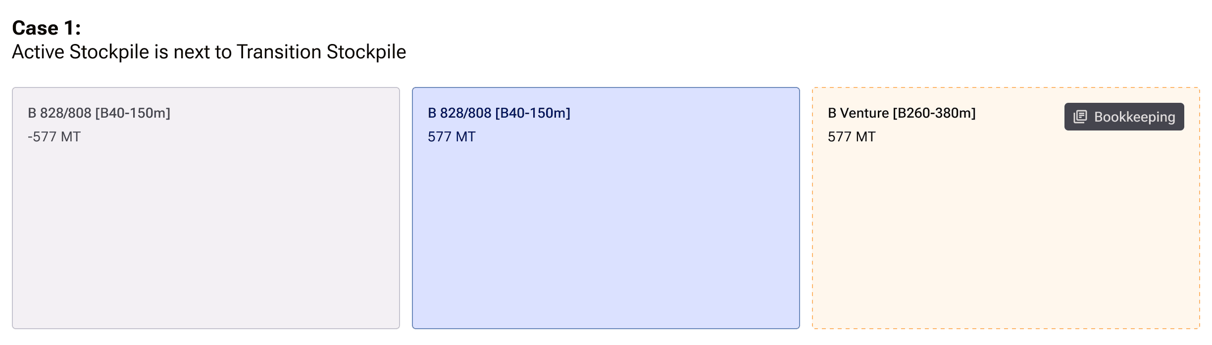
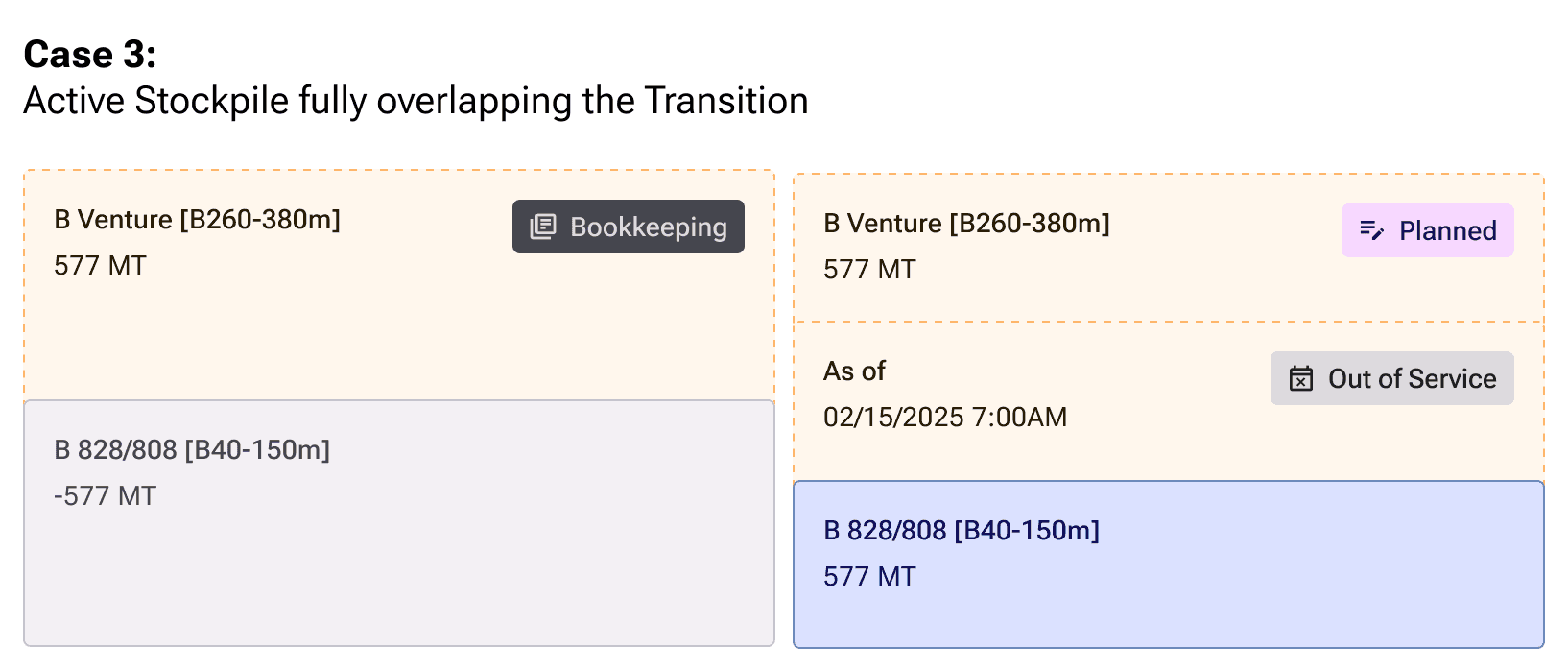
Stockpiles are piles of coal that live in the yard, a space to temporarily keep coal. Each stockpile can have multiple types of coal (a blend).
This is a birds-eye view of the yard. Each rectangle represents one stockpile and it shows:
how much coal is left
what type of coal it contains
if there is a blend of coal
the state
With just plain rectangles, it does not reflect the state of the yard well.
Sketches

Many of my sketch concepts explored the different definitions of the stockpiles.
Lo-fidelity design concepts

Bringing sketch concepts into screens allowed me to further communicate with our users.
Here I wanted to show capacity and the different states of each stockpile through visual varieties.
TESTING FEEDBACK #1:
Hard to accurately represent stockpiles
Many stockpiles did not physically exist in the yard and some were stacked upon each other, so representing them by height became confusing.
So, I explored more ways to represent the stockpiles...
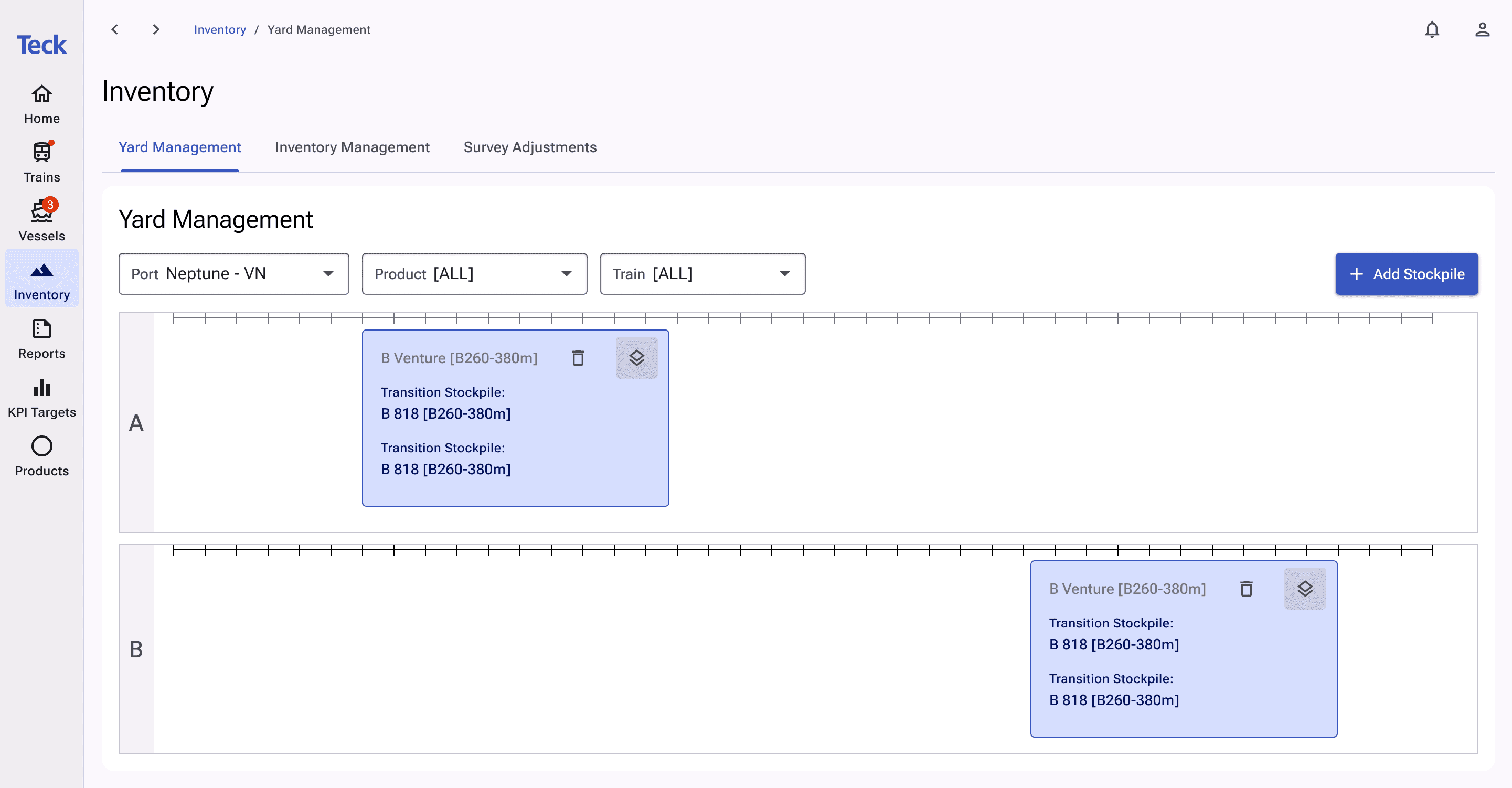
With the users, we created “Transition Stockpiles” to show piles that have not been completely removed, but are still stacked. This has always existed in our old tool, but never defined.
TESTING FEEDBACK #2:
Users loved “Transition Stockpiles”, but wanted an easier way to visually differentiate what was inside the stockpiles
Defining the stockpiles to avoid ambiguity amongst teams

TESTING FEEDBACK #3:
Users loved these new Stockpiles that will accurately reflect the state of the yard
Colour seemed a little dull and users didn’t love that it was the same colour as some of our CTAs
Final design

INCORPORATED:
a brighter blue to represent default stockpiles
Stockpile filters - toggle-based for users to switch between views
Transition stockpiles are shown underneath active stockpiles
Graph Editing - prevents accidental edits from happening as stockpiles can be resized by dragging
THE FINAL DESIGN INCORPORATED:
a brighter blue to represent default stockpiles
Stockpile filters - toggle-based for users to switch between views
Transition stockpiles are shown underneath active stockpiles
Graph Editing - prevents accidental edits from happening as stockpiles can be resized by dragging
11 - Design process for Yard Management.
11 - Design process for Yard Management.
We conducted another UX audit right before launch, and we found...
We conducted another UX audit right before launch, and we found...
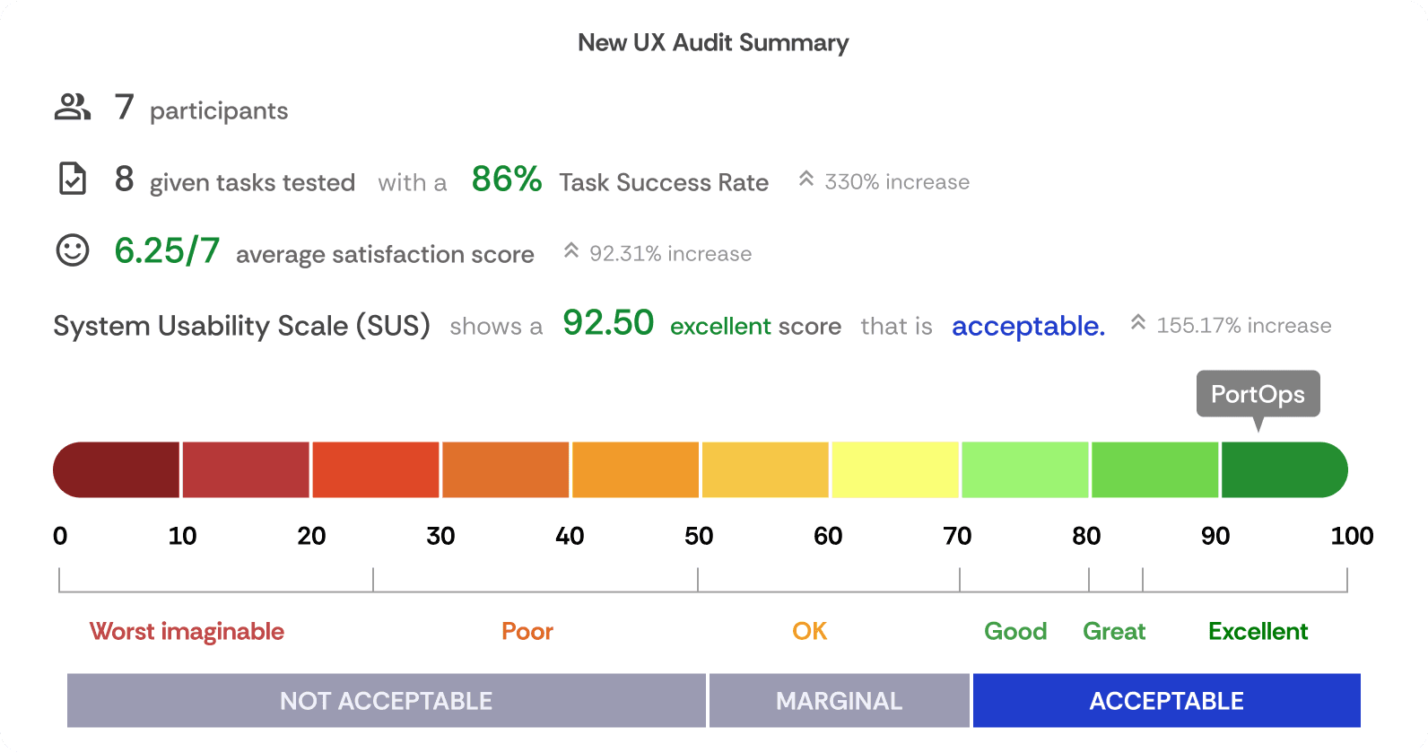
We drastically improved the usability. And our user efficiency. AND their satisfaction! 🎉
We drastically improved the usability. And our user efficiency. AND their satisfaction! 🎉
Compared to our initial findings, this is a huge win for our team. Our redesign project exceeded the business and stakeholders’ expectations for this one year project. I looked forward to testing more after launch.
Compared to our initial findings, this is a huge win for our team. Our redesign project exceeded the business and stakeholders’ expectations for this one year project. I looked forward to testing more after launch.
RETROSPECTIVE
RETROSPECTIVE
The first (and last) project to have been delivered by the Teck Digital Analytics team.
The first (and last) project to have been delivered by the Teck Digital Analytics team.
We launched PortOps in the start of June 2024 successfully. At the end of June, Teck Resources had different business priorities. Majority of the Digital Analytics team was laid off and all remaining projects were put on sunset. Nevertheless, I am so proud of my team for delivering the PortOps redesign, and I learned so much!
Here are my overall takeaways: